Employer Dashboard Redesign
The admin portal for a U.S. healthcare fintech hadn't changed in years. I co-led research across the full employer admin journey, then redesigned the dashboard from a data dump into a tool that shows what needs attention and when.
Fintech, B2B Admin

The admin portal for a U.S. healthcare fintech hadn't been redesigned in years. Employer HR admins and partner account managers used it daily to manage thousands of benefit accounts, but the homepage was a wall of tables and raw data. Nobody could tell at a glance what needed their attention.
I co-led the research with another designer, then designed the new dashboard solo. One year, from discovery through two shipped releases.
Key contributions
Mapped the full employer admin journey with CJM and user interviews
Prioritized 35 pain points using support-effort landscape and Kano model
Designed and shipped both releases solo
Validated designs with UMUX-Lite and 5-second testing
Starting with data, not assumptions
The platform administers HSAs and FSAs for employers across the U.S. — heavily regulated accounts where mistakes create real tax problems. Before redesigning anything, we needed to understand how people actually used the current portal.
We started with Datadog analytics across 28,000 sessions. Scroll maps, click heatmaps, user journey flows. The data showed that most users skipped the homepage content entirely and navigated straight to specific sections. The welcome banner, the summary tables below it — almost nobody engaged with them. That told us the homepage wasn't serving its purpose.
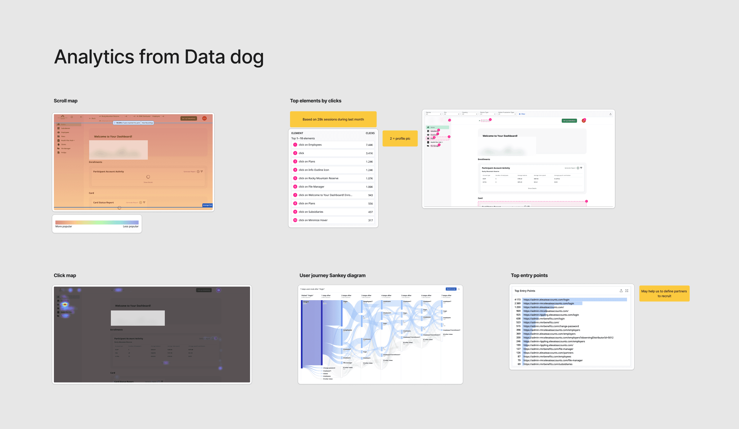
Datadog analytics
Mapping the full journey
From there we moved to qualitative research. Together with another designer, I built a customer journey map covering the full admin year: setup, ongoing maintenance, and wrap-up. We mapped what admins do at each phase, what they're trying to achieve, where things break down, and what they told us in their own words.
We then ran interviews with external partner account managers to validate and supplement the map. I used AI to speed up the analysis of interview transcripts — pulling out recurring themes, clustering pain points, and cross-referencing them against the CJM. What would have taken days of manual affinity mapping took a fraction of the time.

Hi-Fi CJM diagram
35 pain points. A few patterns kept repeating: admins couldn't find the data they needed, deadlines came as surprises, there was no visibility into how employees used their benefits, and self-service was almost nonexistent. People were building Excel spreadsheets to answer questions the platform should have answered.
Prioritizing what to build
We had more problems than we could solve at once. So we built a framework.
Each pain point got plotted on a support-effort landscape: how much support effort it created versus how much return fixing it would bring. That gave us four quadrants and a clear sense of what to tackle first.

Support/Efforts Landscape
From there we brainstormed solutions for each prioritized pain point and built lo-fi concepts. I used AI to rapidly generate layout variations and explore different ways to structure information before committing to a direction in Figma. Then we ran those concepts through a Kano model to separate must-haves from performance payoffs and nice-to-haves.
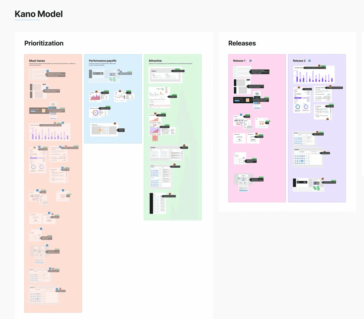
Kano model prioritization and release plan
That framework gave us two clear releases. Release 1: the restructured homepage — turning a data dump into a decision-support tool. Release 2: account-level usage views that gave admins visibility they'd never had before.
Redesigning the homepage
The old homepage: a welcome message followed by a stack of payment tables, invoice tables, and forfeiture data. Every piece of information had equal visual weight. Nothing told the admin what to look at first.

Old dashboard
The redesign organized information by urgency. At the top: what needs attention right now — account health, compliance indicators, upcoming funding. Below that: a calendar that surfaces deadlines and scheduled events before they become problems. The structure was driven directly by the pain points from research: if admins kept getting surprised by deadlines, make deadlines the first thing they see.
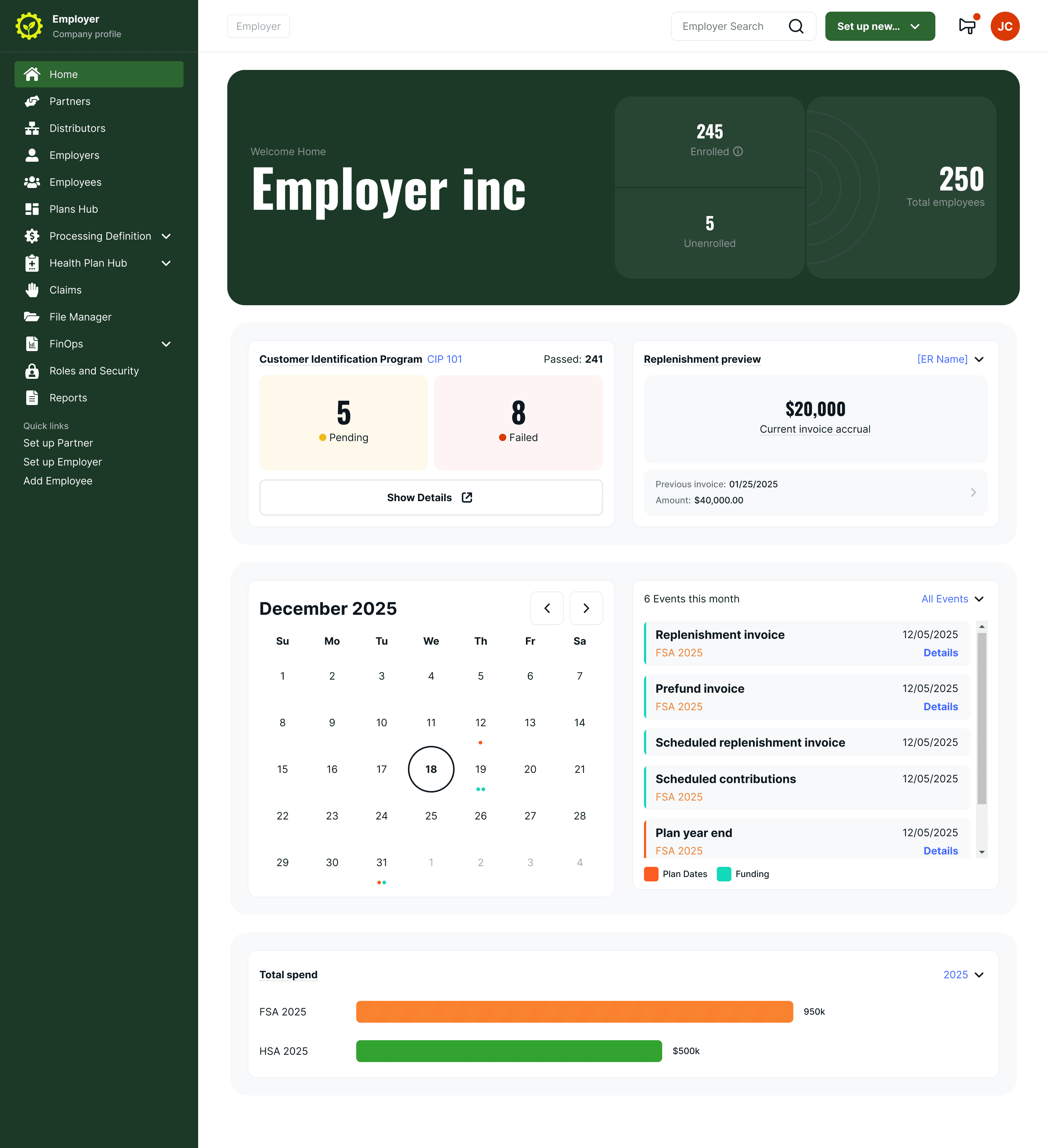
New dashboard
Giving admins visibility they asked for
One of the clearest research findings: admins had no way to understand how employees used their benefits without pulling reports and cross-referencing them manually.
The new account usage pages give each plan type its own view, surfacing the metrics admins actually asked for in research. Different account types need different data, so each view was tailored rather than forced into one template. The goal was to replace the Excel spreadsheets admins were building manually with something that answers the same questions in one screen.

Account usage view
Testing and validation
I used AI to help prepare test scenarios and task flows for usability testing — generating variations of realistic admin tasks based on the workflows we'd mapped in the CJM. This made test preparation faster and the scenarios more grounded in real usage patterns.
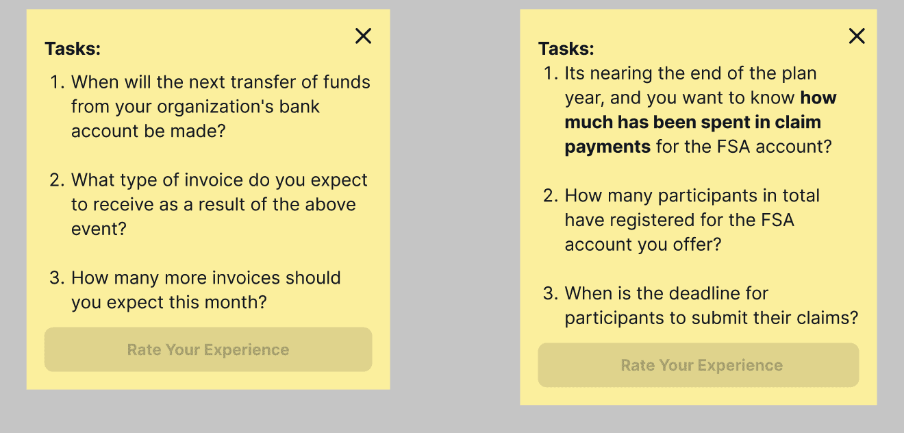
Usability testing tasks
SUS score: 82.2 — Excellent (Grade A)
We ran UMUX-Lite with 10 participants. 8 out of 10 scored above 80. The redesigned dashboard landed in the top tier of the standard SUS interpretation scale.
5-second test: 100% rated the design 4 or 5 out of 5
9 participants saw an account usage page for five seconds. Every response rated the visual design 4 or 5, with 67% giving it a perfect score. When asked what the page was for, all participants correctly identified its purpose and key content areas. They described the layout as clean, simple, and logical.
Outcome
Research became the roadmap.
The CJM and prioritization framework didn't just inform design. Product management used them to plan the roadmap. Engineering used them to understand why we built what we built. The support-effort landscape became a reference document that outlived the project.
Every feature traced back to a real pain point.
Nothing was designed on assumption. When stakeholders asked "why this feature?" we pointed to the data.
Learnings
Research is the design.
I used to think of research as the phase before design starts. On this project, the CJM, the pain point mapping, the prioritization — that was the design work. By the time I opened Figma, most of the hard decisions were already made.
AI as a design multiplier.
This was the first project where I used AI consistently throughout the process — not for generating final designs, but for the work around the design. Analyzing interview data, exploring layout directions, preparing test scenarios. It let me cover more ground as a solo designer than I could have otherwise. The thinking still has to be mine. But the throughput changed.
Prioritization frameworks earn trust.
As a designer, being able to say "here's why we're building this first" changed how the team saw my role. It wasn't just about screens anymore.